Why Blog?

Why add our blog to the multitude already in existence? Julie and Marie are dedicated to growing as artists and creating excellent art. Like others who are self-employed, artists often work alone. It’s easy to get sidetracked by household duties, other responsibilities and activities, and whatever moods come across us. A blog in which we set up creative challenges keeps us accountable to each other and those who participate in our blog, creates an opportunity for an online artist community to form in which we can encourage and help each other, and gives our art visibility beyond our geographical community. We hope we inspire you, you inspire us, and we all grow and prosper as artists.

Friday, December 3, 2010

Back to Basics with Line


Five Siamese 4x10 transparent watercolor


Marie  In art, line is frequently the first mark on the page; the tool an artist uses to begin a piece of work.  The use of line is a topic infinitely important, complex, and beyond my ability to explain in one paragraph. To sum it up crudely, line creates motion, action, emphasis (think of eye liner) and emotion (think of a row of soldiers vs. a landscape with rolling hills) and leads the viewer’s eyes through the painting.  Lines don’t actually have to be lines to say line:  In my painting, Five Siamese, I used value contrast—where dark and light areas meet—to create whimsical “lines” that direct the viewer’s eyes through and around the painting (see my clumsily drawn blue lines). The cats are still, yet full of movement.  The value difference between the bottom edge of the cats and the bedding below creates a line (red) that unifies the cats as one object.  The cats are separate, yet one.


Worlds Apart 15x11 soft pastel

Julie  The main focus of the painting Worlds Apart is old versus new, and line is what helps distinguish the two. The hard architectural lines of urban life are juxtaposed against the organic soft lines of the figures that stepped in from a simplified time period.  At the same time, the lines of the sidewalk, railing and skyscrapers connect the figures to their settings. 

Tuesday, November 23, 2010

Tuesday, November 16, 2010

Back to Basics with Value

Eggplant and Greens 12x16

Julie  Value makes a painting come alive and gives it dimension and shape. Many elements of painting are key to a successful painting, but value will give your art a realistic edge if that is what you want to accomplish. The painting I chose to demonstrate the use of value was painted with soft pastels from a photograph I took at a very unique and fun organic vegetable farm in NW Illinois. We were making vegetable soup from the ingredients we picked on the farm. Beautiful sunny day with strong, late morning light produced a photograph with strong contrasts in value. What do you think?


Peter  10 x 14


Marie  Value isn’t my thing.  I mostly paint people and struggle with creating clear, dark shadows on skin.  In the painting of my nephew, Pete, I started with a value sketch (for those of you who aren't artists, a value sketch is a quick one color sketch that shows how dark various areas of the painting will be) that showed dynamic contrast between the darks and lights, but when I actually sat down to paint, I was mesmerized by the curves of his mouth, the shape of his nose, and the translucency of his eyes.  All thought of value was pretty quickly forgotten.

When I did remember, later in the process, I knew that any darks I put in the background that would make his face pop would have to be repeated in the foreground (thank you, Lenox), and I was afraid to do anything that might mess up the portrait I love so much.  This is a common theme in my painting process.  My solution was to make the background darks not as dark as I had planned, but dark enough to emphasize the curve of the back of Pete’s head and his profile and add a few corresponding darks in low risk areas on the head, such as the eyebrow, the pupil, the inside of the ear.  I’m happy with the result, but if I looked at it framed from across the room, I would probably be unhappy with its inability to grab attention from a distance.


Monday, November 8, 2010

11/8/10 Entering Competitions

Marie  The first assignment we gave ourselves is to enter an art competition.  The Artistsnetwork.com recently sent an announcement for FineArtWorld.com’s juried art show for a wide variety of mediums with a December 15, 2010 deadline.  The timing is right and there’s no entry fee so why not?  Now, what to enter?  The smartest thing to do seemed to me to find out who the juror is and see what kind of work he or she does:  not only in which medium, but also what the work looks like, such as abstract vs. realistic, high value contrast vs. subtle value contrast, bright color vs. subdued color, etc.  Two problems:  I can’t seem to find out who the juror is and I only paint watercolor portraits and figures, anyway, and I don’t have a variety of styles.  It’s a better question for Julie, who does different mediums and whose work is more varied.  I read through the submission form and learned that I’d have to accept their membership agreement, which includes pages and pages of fine print.  It turns out that FineArtWorld.com is essentially an online gallery that artists can join (for a fee) and show their art.  The prize for winning the competition is free membership for a limited amount of time.   I couldn’t find anything objectionable in the fine print, and I thought the work shown was of pretty good quality.  In fact, the artists’ bios I read include lists and lists of awards. I wonder if any of them are selling their work through FineArtWorld.com?

Back to the question of what to enter.   I looked through my paintings and selected ones that I like the most and that I have already spent copiously amounts of time manipulating on my computer to get a good high-resolution likeness of the originals.  That, done, on to the next assignment.

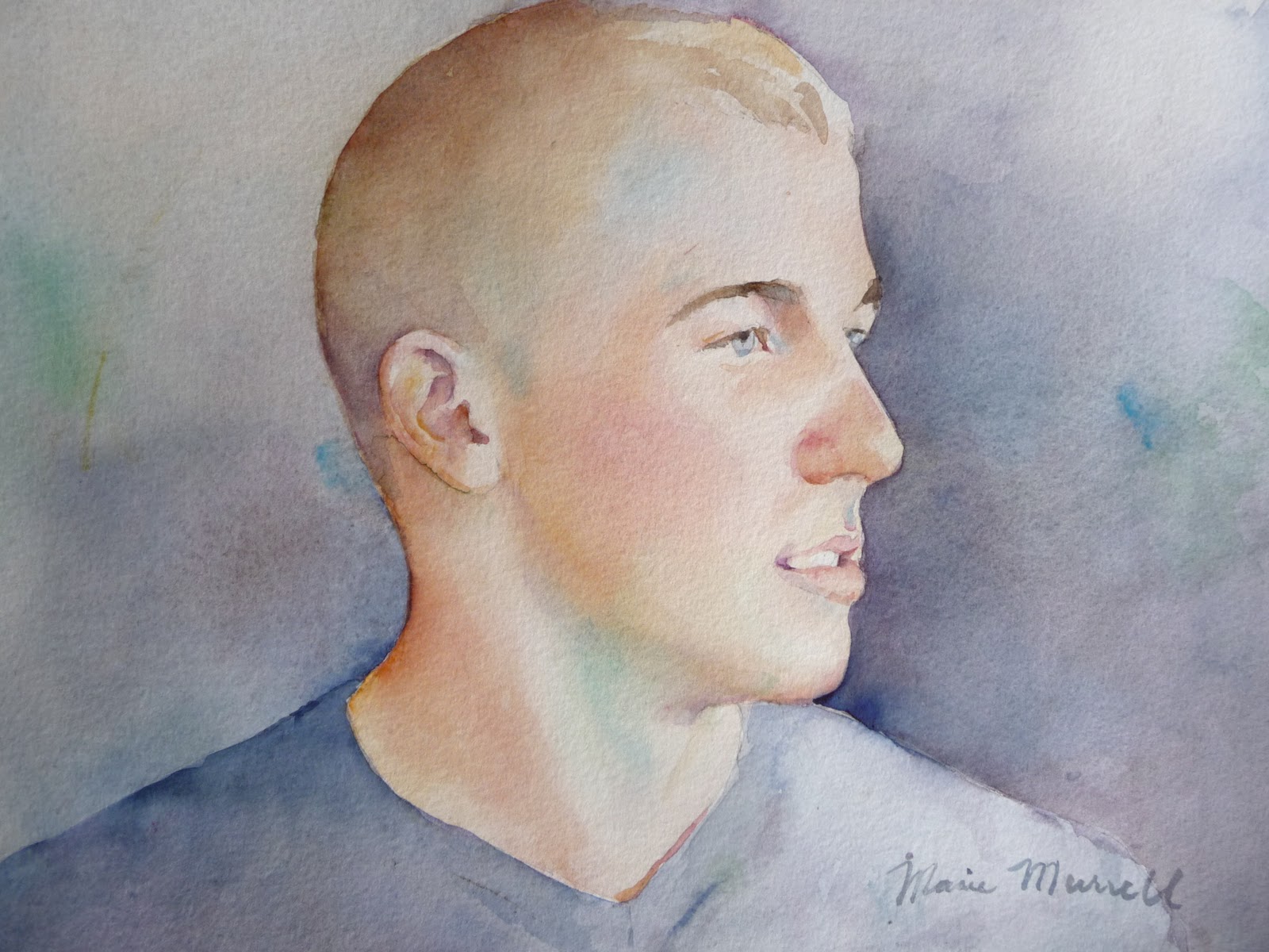
Bruce 18 x 23" Transparent Watercolor

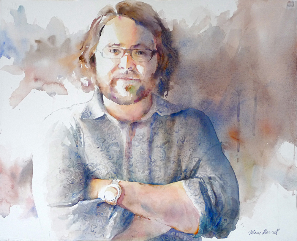
Barista 12.5 x 20.75" Transparent Watercolor

Julie I agree with Marie. A great competition for us to start our blog with little financial risk and just a little paperwork to complete online. There is an opportunity to submit two pieces of artwork. Since I am happier with my pastels and palette knife oil paintings lately, I will try one of each.  I have been able to achieve a better sense of light and dark contrasts and able to keep the colors fresh in these two mediums. The oil painting is a fall scene from a trip to Bloomington, IN. We took a few back roads and ended up at Monroe State Park. Beautiful fall trees, bright light and a windy path created a beautiful composition. The pastel I’ve chosen is an old ceramic crock filled with eggplants. Another fun fall scene with an unusual color choice for me.

We'd love to hear about your experiences with entering a competition. We'll keep you posted!

Next assignment- Back to Basics with Value...

Fall Around the Bend 12x16" oil painting


Eggplant Extra 15x11" soft pastels